tAAt 2017 new year demo breakdown writeup
Let's spin it!
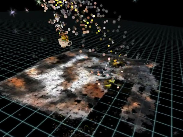
So I had this idea of a UFO flying around, throwing letters on the ground, and that would make a decent writer thingy. Then I figured the things thrown could be pixels instead, so that one letter's worth of pixels was thrown at once. Which lead to the idea that I could also have complete pictures thrown. Which then lead to me being too lazy to write code for the writer thing and just did the picture thing, since pictures can have letters drawn in them. Oh well.
Instead of flying around, you get yet another of my let's-spin-around thingies. Sorry if your room is spinning after watching this for a while.
I did start with the idea of a UFO but that turned into a teacup somehow, and instead of an alien I put a lucky cat in there. The cat has actual four frames of animation, which I could have used more effectively, but it's one of those good enough things I guess.
And flying became bouncing, which might work with music. Then I added structure: the camera rotates the image so that you see the image being drawn, then see it right side up for a while, before next image drawn.
I wrote the toss physics code (you're at [x,y,z], you need to hit [a,b,c] N seconds later, what's the angle and speed) and found that the math wasn't accurate. Instead of figuring that this is a bad thing, I figured that it might make the end result a bit more artistic. I added some additional randomness to things (the size, x/y scale, rotation and position of the splats is a bit randomized). What might have improved things further would have been to use several splat textures, but...
One of the original ideas was to, after prototyping, convert everything to be shader based so I could add things like paint mixing, running and dissolving maybe, but after getting the premultiplied alpha working (thanks, Tonic), I considered the whole thing Good Enough(tm) again.
After getting the whole thing more or less together, I was capturing video for YouTube, and that failed several times, forcing me to watch the demo over and over again. At that point I figured a small change that would make it look much better.


You see, originally the pixels were thrown on the screen in a swizzled order. Not linear, but more or less Morton-ese order. This looked fine, I guess, but it was a bit too rigid. (Non-existent pixels were also ignored, so smaller images got overdrawn more than large ones).
I replaced this draw order by a sort key based on hue, saturation and value of the pixel color, in that order of priority. That made it look much more like the images were being painted (since similar colors got drawn in order), and I'm much happier with the end result.
In the end this new year's demo went through five revisions, which is at least a couple more than usual. I changed the images a couple times. The images are based on some royalty free, free images on the net. Scaling things down to "pixel art" resolutions helps a lot there. If you want to see what your images would look like, feel free to edit the frames.psd in the data directory. Just don't.. distribute it then... okay?
From the technology point of view there's fairly little else to say. Little touches; small particles are emitted when a splat hits. Splats (and the cat) have top-down shadows. Explicit ordering (there's no z-buffer or sorting) - sometimes order fails but you can hardly notice. Little flare particles in a half-dome (mirrored, of course) to create feeling of how big place you're in. Cat is a nailboard sprite.
And that's it for another year.
Comments, questions, etc. appreciated.