


 Sol::Code
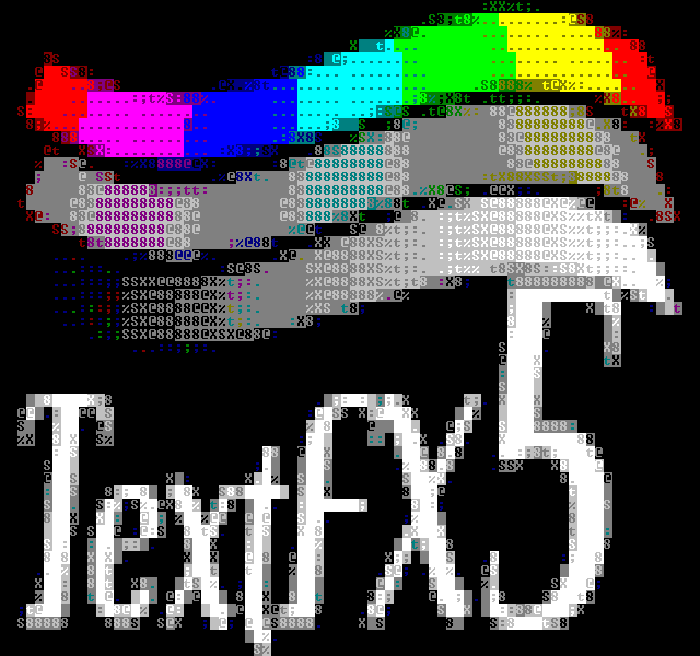
TextFX - The Art and Science of Text Mode Conversion
Downloads
textfx7.zip
1219kB
TextFX textmode graphics library, revision 7
Lots of bugfixes and cleanup; the image quality is massively improved. New testbench application included which can be used for regression testing when developing the conversion filters.
textfx6.zip
627kB
TextFX textmode graphics library, revision 6
Massive update including various improved and new rgb to textmode filters.
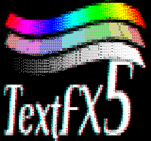
textfx5.zip
187kB
TextFX textmode graphics library, revision 5
A refresh of my textfx routines, including the old blockcolor and asciiart converters as well as new colorful asciiart and half-block modes, and some ditherers for fun measure.
Also includes c++ version of my fli/flc player.
textfx4.zip
152kB

TextFX textmode graphics library, revision 4
Majorly rewritten c++ version of my old textfx routines. Includes two separate rendering methods: the old blocky color mode, and new ascii art mode. Both methods are used through the same interface.
Mainly targeted towards WinNT console, but the core of the code should compile as-is under DOS as well, if anyone really needs that anymore.
Also includes c++ version of my fli/flc player.
Algorithm Information
This page is a journal of sorts, describing the algorithms used and their development. More recent information appears at the bottom.
I started working on textmode demos over a decade ago, when DOS was still the de facto operating system. While there's other creative ways of using text mode to create demo effects in, the most typical idea is to take a graphics framebuffer (say, 320x200x32bpp) and figure fun ways to convert that to more-or-less ASCII art.
Doing such conversions was a commonplace thing back then - not to textmode, but otherwise. Back then, most video displays didn't have truecolor modes, or they were nonstandard or buggy. The most common graphics mode was 320x200x256c - 256 colors from a palette of 262144. A more or less common trick was to do your rendering in truecolor and then perform a lookup table conversion pass to the screen.
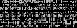
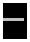
Anyway, in text mode, you have a bunch of glyphs:
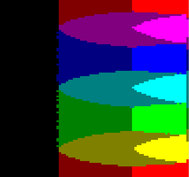
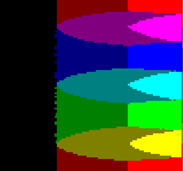
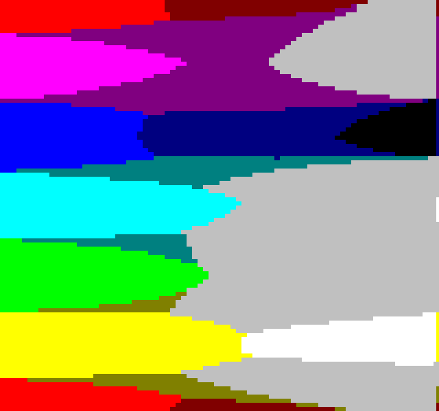
For each character on screen you can pick a background and foreground color, from a massive palette of 16 colors: (note: this is NOT the correct palette, as I found later on - keep reading far enough and you'll see)
That's the current NT console palette, mind; the original DOS textmode palette was, in ways, better:
The colors were not as "clean" (i.e. instead of 0,63,0 you'd have 21,63,21), and there was a "light black" color as well, instead of two "black" colors. If you've tried to view old ANSI art with the new palette and wondered why it looks wrong, this is why. But this is but one thing Microsoft has done to kill off textmode demos - the font is subtly different from the DOS age, and I hear Vista doesn't let you have a fullscreen console anymore.. But I digress.
Reference Images
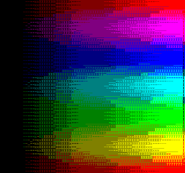
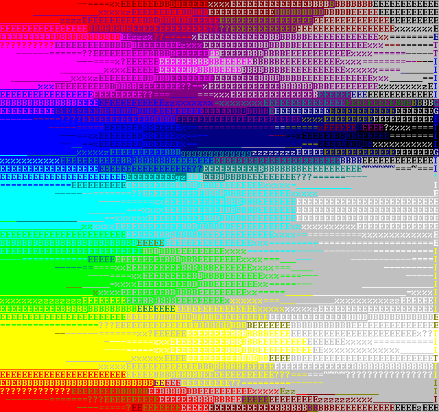
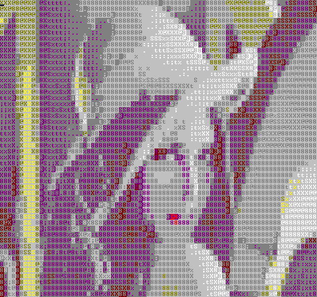
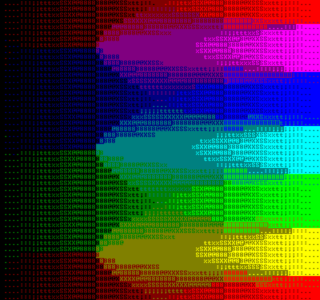
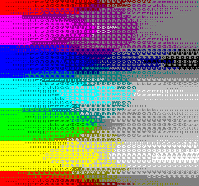
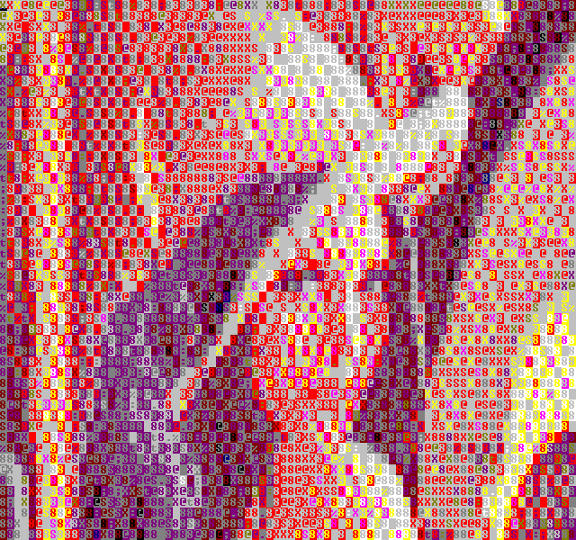
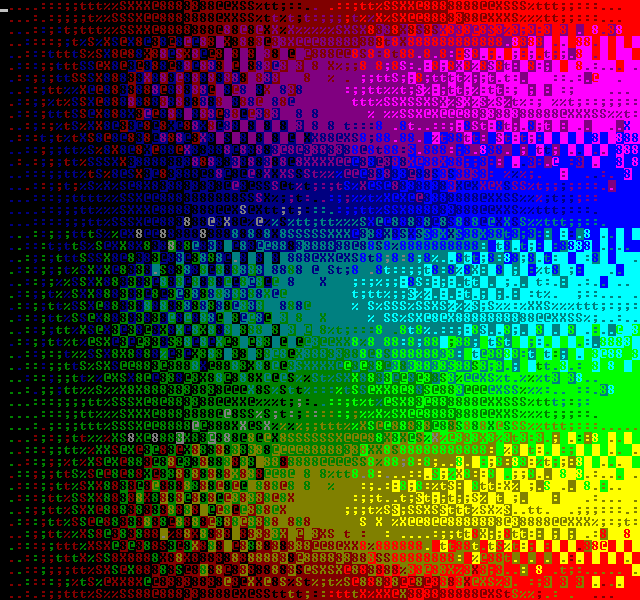
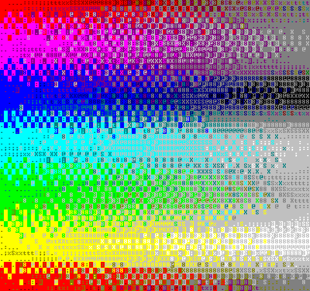
When analysing the different converters I'm using a bunch of test images. Here's the original images for reference:
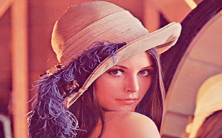
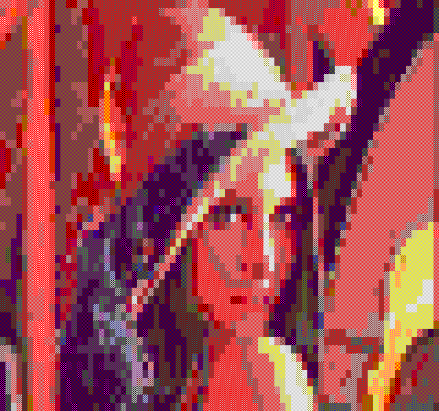
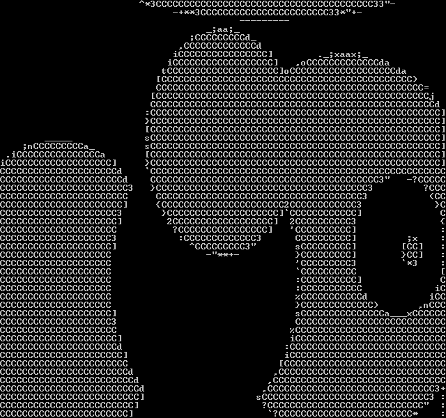
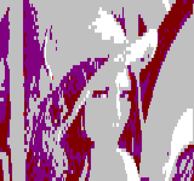
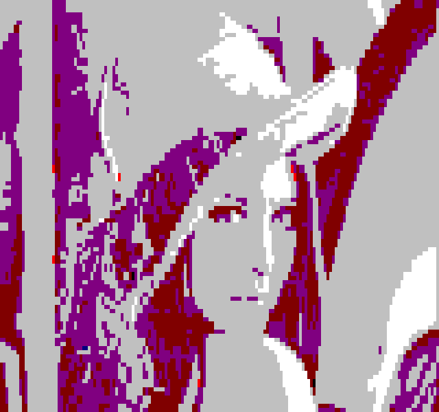
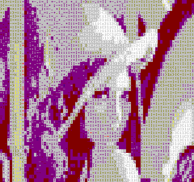
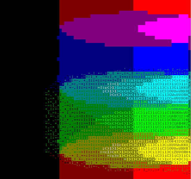
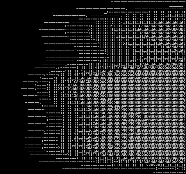
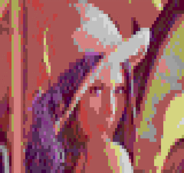
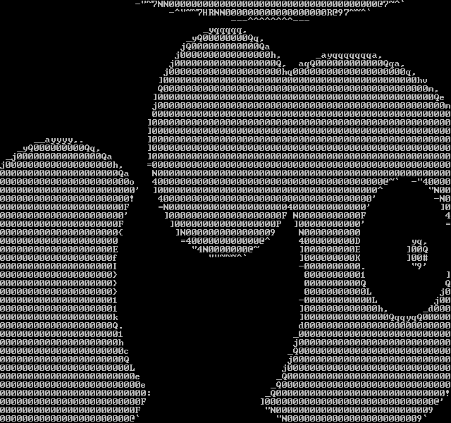
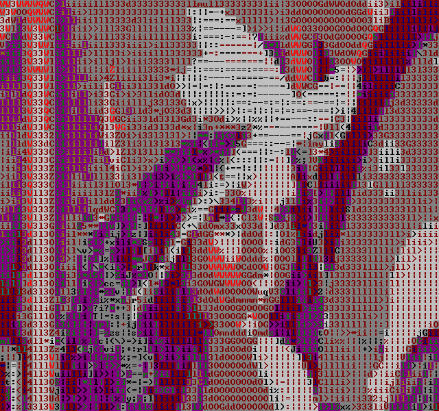
The classic 'lena', scaled and cropped to be usable in text mode. Note that if I would run the image through Photoshop's "auto contrast", "auto color" or "auto levels" filters, the resulting image would not only look better, but would also convert better. I opted to leave the image as is, apart from the scaling.

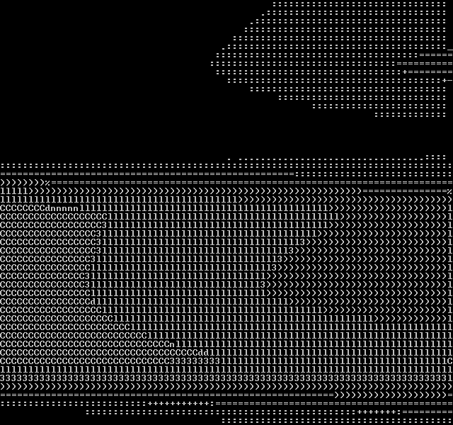
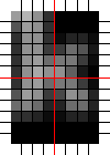
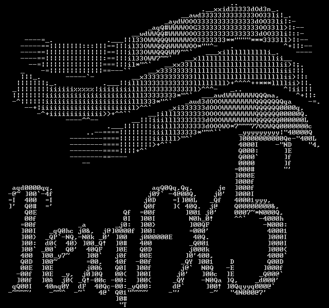
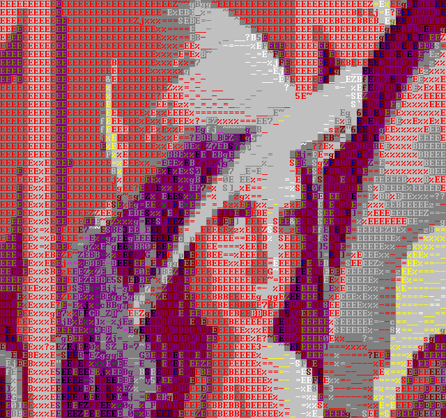
Some black and white curves, to look at edge charasteristics.
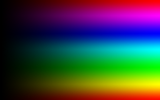
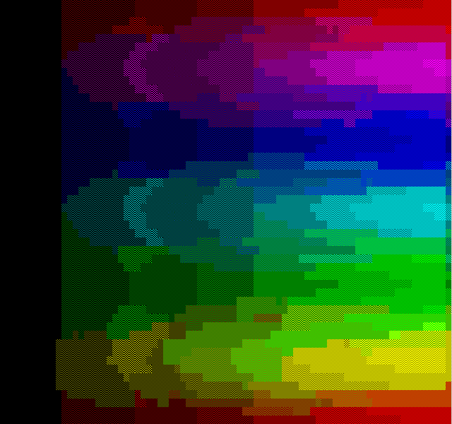
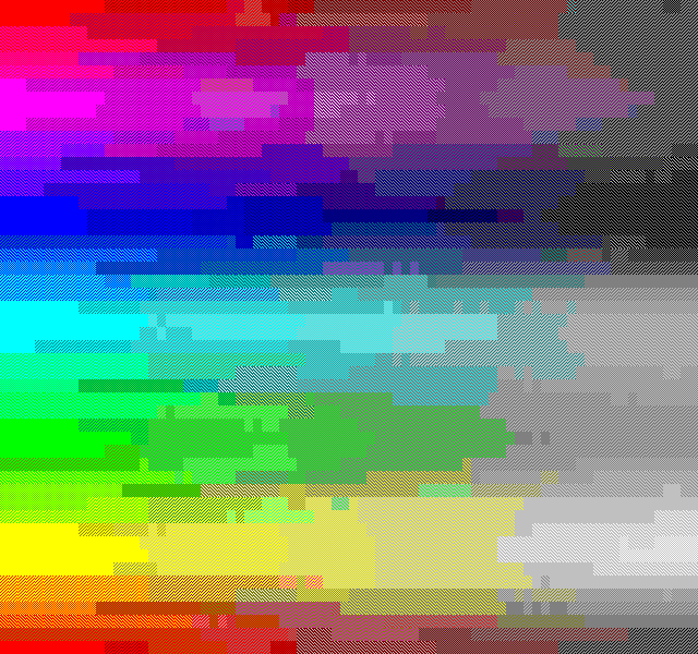
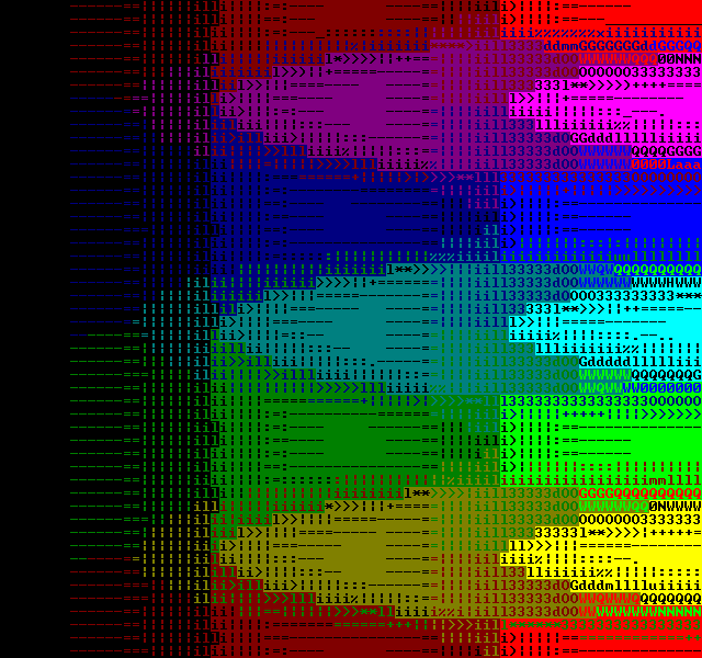
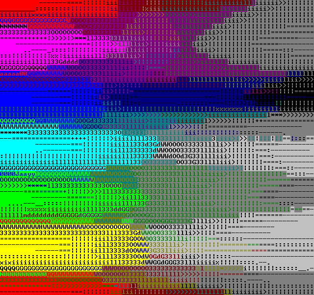
Color ramps, for color reproduction purposes.
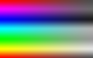
Saturation ramps, for the same reason.

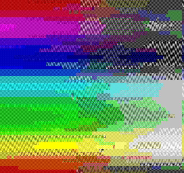
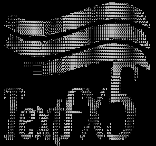
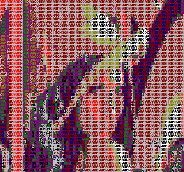
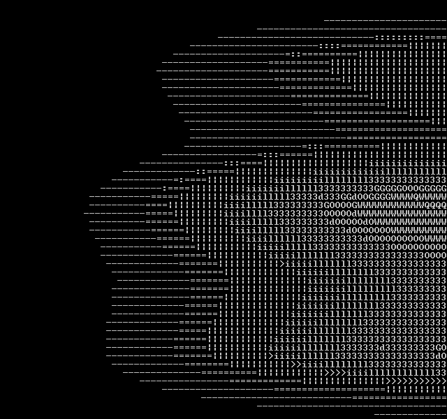
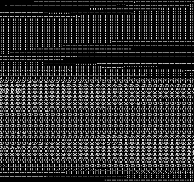
A multi-purpose test image including complex edges, color ramp with a couple saturations, and grayscale ramp. The low-saturation ramp is interesting to look at in most filters, as it tends to wash out to grey.
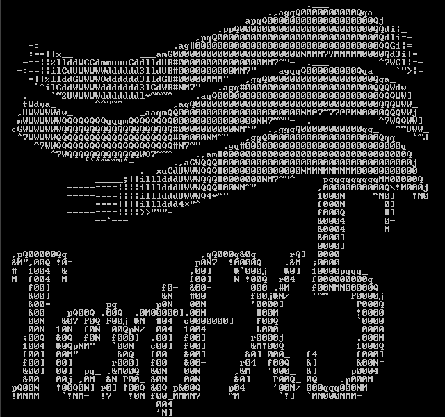
For purposes of readability, all the result images have been scaled down 50%. Click on the images for the original image. There's also a glitch in the right edge of the images due to a bug in the image loader, which is irrelevant for the purposes of this document.
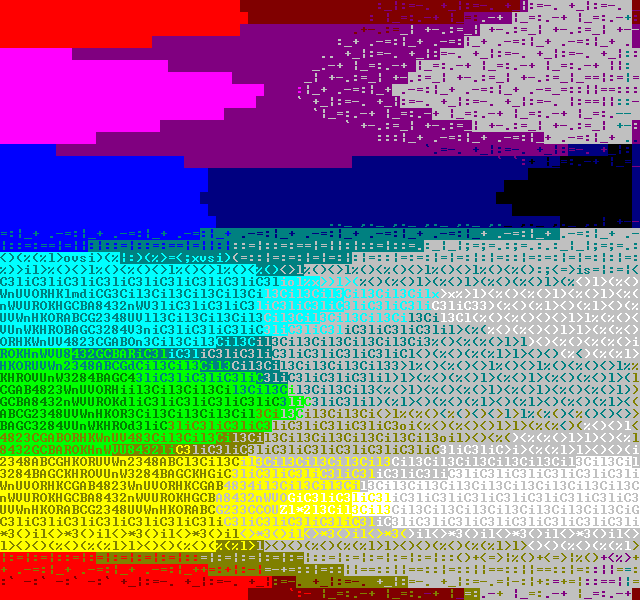
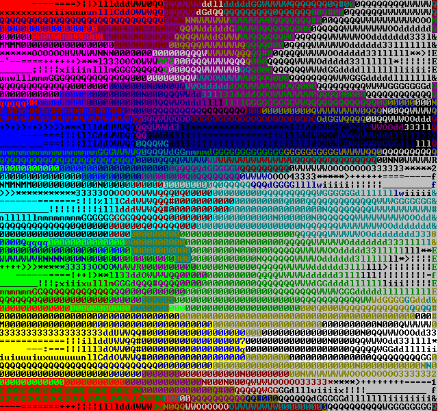
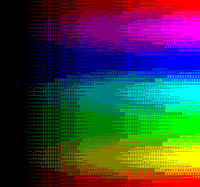
BlockColor


The first idea was to take the 0%, 25%, 50%, 75% and 100% "dithered" blocks from the font and use those to represent the graphics. In the end all you need is the 0%, 25% and 50% blocks, as you get the rest by reversing the background and foreground colors.
This converter gives you pretty good range of colors, is very cheap - a lookup table of 64x64x64 indices doesn't take all that much memory nowadays. Originally I used 16x16x16 lookup table, which didn't take that much time to calculate on the slow PCs back then, and only took 8kB of memory.
As CPU power increased, the internal framebuffer size grew from 80x50 to 160x100, and simple averaging downscaling was used.
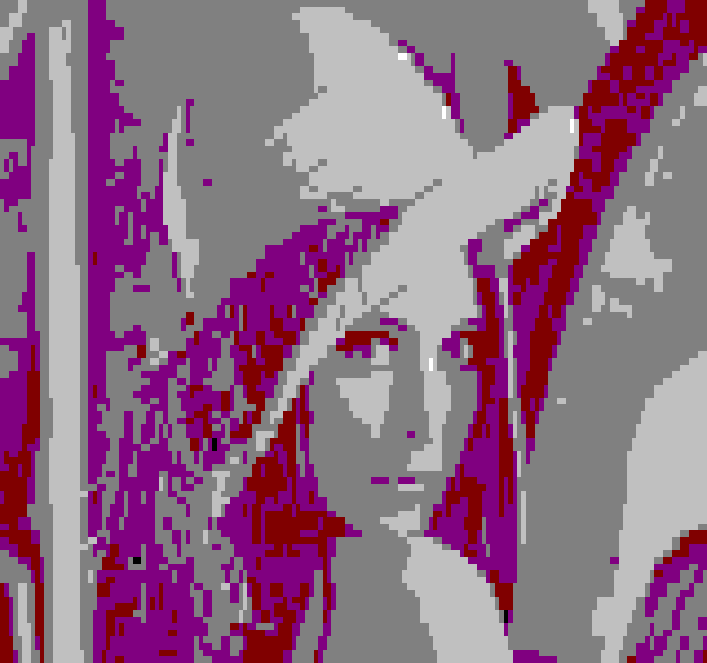
There's a clear glitch in the colors - as can be seen in the cheek and shoulder of the lena test image, for example, which is most likely caused by the fact that the dithered glyphs are not as "clean" as they were on the DOS age. Approximating the correct percentages for the blocks would probably improve output quality.
A small temporal dithering opportunity exists in swapping between the 25% and 75% dither tiles, as well as swapping the colors in the 50% tile.
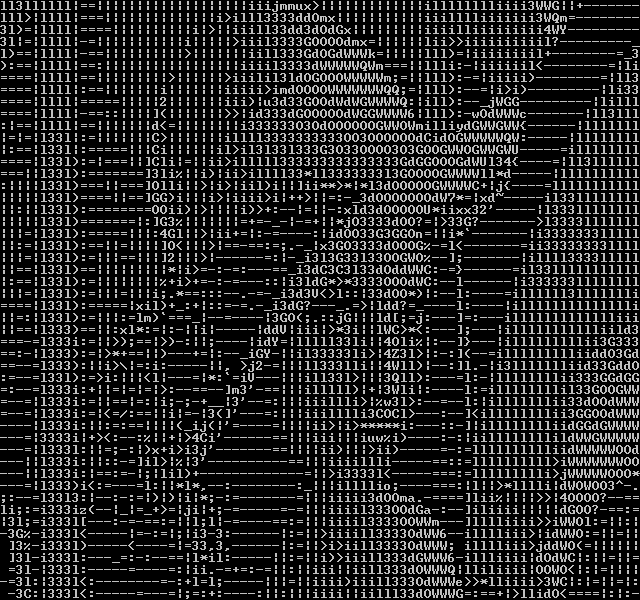
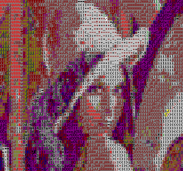
AsciiArt


I don't know how aa_lib does it's magic - never bothered to dig too deeply in it - but partially due to it's existence I was motivated to write a realtime "ascii art" filter.
While BlockColor was good for getting plenty of colors, "fitting" ascii characters to the graphics tried to increase resolution.
The AsciiArt filter also used a lookup table. Each character glyph was split into four quadrants, and a score of 0-15 was calculated for each. Then, a 16*16*16*16 lookup table was built, finding the closest glyph for each.
So the total number of bits active for each quadrant is:
| 14 | 5 |
| 7 | 6 |
Since I needed values from 0 to 16 for performance reasons, I decided to scale these down. Why on earth I decided to introduce unneccessary error in the equation at this point I have no idea - it would have been more beneficial to scale up to 0..255. Anyway, the result is:
| 9 | 3 |
| 4 | 4 |
This works relatively well. When looking at the result images above, remember that this filter only reads the green color channel - it was meant only to read greyscale images. However, if we have a thin horizontal line in the source image, it would make sense to use the minus character for it..
Now, if the line happens to be just one pixel lower than what the glyph expects, we have a 100% miss. In any case, other glyphs may be closer, as we don't care where the pixels are in the quadrants.
Note that the AsciiArt filter (and all of the variants that are to come later on) only use glyphs 32..126 of the font. This is pretty much my personal preference - it looks "cleaner" in my opinion than using the whole "IBMSCII" range.
As for a color version, I experimented by taking just the color of the pixels and picking one of the 16 colors for it, but as it didn't work out too well, I didn't worry too much about it.. for about 7 years.
Half-BlockColor


When TMDC 11 was approaching - the first TMDC in which I'm not an organizer - I started pondering on making new filters. One that was pretty simple idea was to use the half-high filled block and to generate a 80x100 resolution of sorts, kind of like what Alpha Design had used in a few of their textmode demos (even winning one TMDC).
There's nothing really fancy going on - just averaging a block of pixels and fiding the closest color pair.
Half-BlockColorWide


And, for a heck of it, I also made a version that uses the half-wide filled block character, for a resolution of 160x50.
At the suggestion of Jetro Lauha, I combined the two.
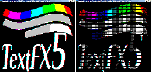
Half-BlockColorDynamic


This filter calculates both of the half-tall and half-wide color combinations, and picks the one that is closest, resulting in an almost 160x100 resolution with 16 colors.
Apart from dithering, I can't think of any way to improve this line of filters.
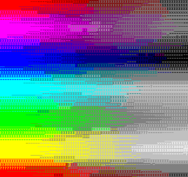
Color-AsciiArt

I'd been using LibCaCa for several TMDC invitations, but felt that I might take another attempt at my own color-asciiart converter.
I looked at how libCaCa does things, and was surprised to find that it doesn't actually care about glyphs at all. Instead, it has a small number of characters it treats as a grayscale ramp, and works based on that assumption. In a way, libCaCa is an improved version of the good old blockcolor =)
I figured that since eye cares more about brightness than color, I could get away with just using the ascii art filter and blit the glyphs using the same kind of color pair selection that LibCaCa does, i.e: find the closest color and use that as background, then find the second-closest color an use that as foreground. The result was not as good as I'd hoped, but I used this filter in my TMDC11 demo in any case.
To improve matters - or so I hoped - I added some temporal antialiasing, by collecting several glyphs in the lookup table instead of just the first hit, and cycled between these in subsequent frames.
Then I decided to be scientific about it.
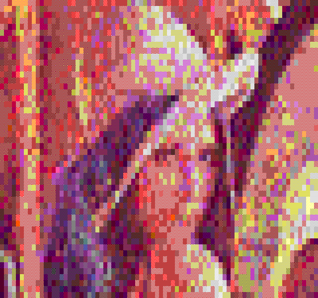
BruteForce
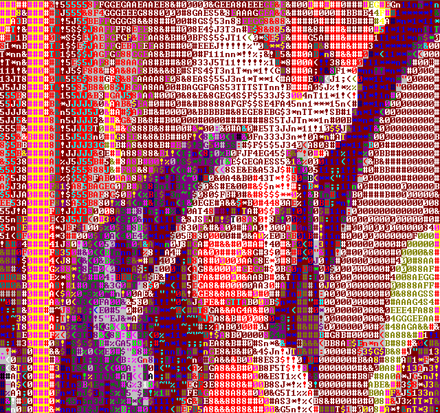


After TMDC11 I decided to do some more work on the filters, and for research purposes wrote a bunch of non-realtime filters as well. The first approach was to take the source image, scale it up to the 640x600 resolution using bilinear interpolation (as the font is 8x12, and 80x50 characters) and then go through every single color and glyph combination, looking for the closest one.
The result was very, very slow, and the result was bad. As an alternative, I changed the distance metric not to check for the square sum distance but to add up all the r, g and b differences and then use the sum of these values as the error. The result can be seen above. Rather noisy, but much better than my realtime filters.
There's several problems here, but the most clear is the hit-or-miss nature of the pixels in the glyphs. Let's look at the minus sign case again:
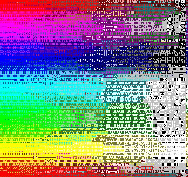
I figured I should get a better result by applying a blur filter to the glyph before matching, like so:
The result was much more pleasing:


Note that the dark end of the ramps is bigger than with the earlier filter. I believe this is due to the blurring.
AsciiArt2


Next I decided to apply the blurring of the glyphs to the ascii art filter lookup table generation. When looking at the images above, remember that this filter uses R, G and B when calculating the intensity, not only G like the original AsciiArt filter. In any case, the result is much better than with the original.
Instead of bits, each pixel has a value in the range of 0..255, and the sums are:
| 2700 | 948 |
| 1428 | 1068 |
which, when scaled down to 0..255 scale gets us:
| 112 | 39 |
| 59 | 44 |
There's some error generated here like with the original scaling to 0..16 range, but the error is smaller by an order of magnitude. Converted to percentages, the pre-scaled and scaled values of the non-blurred 0..16 case are:
|
|
And the pre-scaled and scaled values in the blurred case:
|
|
I consider this error to be insignificant enough (especially considering the 16 level lookup table).
Due to the power loss caused by the blur, the lightness got capped at about 50% brightness. I multiplied the glyph brightness by a factor of two to remedy this situation.
Color-AsciiArt2


Inspired by the progress, I took another poke at the colored version. Instead of just using the two most probable colors, I started off by taking the most probable, or primary, color, and used that as the background color as before.
Then I subtracted the primary color from the average, and used the result to find the secondary color. This worked pretty well. Then, before looking up the glyph, I also subtracted the primary from the source pixels, resulting in rather good color gradients.
This did dull down the glyphs somewhat, though, since the typical range of the pixels would be below 50% brightness. I multiplied the result by two, and the result clearly improved.
There's clearly plenty of room for improvement in this line of filters - if you look at the grayscale ramp for instance, it turns blue at the low end. It does not pick blue because it's a dark color, but by chance - blue happens to come first in the dark color palette.
For Comparison: LibCaCa 0.99b16

For comparison, I've generated the same test images with LibCaCa 0.99b16. The above is without dithering. LibCaCa works very well with the Floyd-Steinberg dither, so I generated those as well:


LibCaCa has several things going for it - it uses the color range well: only really black is black. The color mix is also excellent. Pretty much the only thing that it doesn't excel at is the fact that it doesn't really care about glyphs, so edge character geometry isn't taken into account.
Further Work
Apart from simple dithering, which can easily be seen as beneficial from the LibCaCa images, there's a couple of different kinds of temporal dithering that could be experimented upon:
- When generating lookup tables, more than one "hit" can be found for several entries. Collecting all of these and cycling between them in subsequent frames may result in a better image.
- From trixter/hornet's video lecture on the "8088 corruption" demo: error could be pushed forward in time, and applied to the next frame.
Doing the conversion in HSV color space might work better, as the "hue" is very limited and "saturation" even less so.
TextFX7
After the release of TextFX6 (and the information on this page) I decided to dig a bit deeper still. TextFX was based on plenty of assumptions which I had made back when I did the first port of TextFX to windows. Several of these were wrong. Additionally I found several bugs.
The first assumption that was wrong was that the dithered blocks would be 0%, 25%, 50% and 75%, while in the default NT console font the values are actually 0%, 33%, 50% and 66%. Fixing this made BlockColor look better. What made an even bigger impact for BlockColor was the fact that it was configured to use the old DOS palette instead of the proper one. Rather embarassing.
While on topic of the palette:
That is the correct palette (Aren't you glad you read this far?). There's no second black. I have no idea where that assumption came from. It's possible that this bugs in win98 or win2k - but it seems to work on winxp.
Further bugs included reading the glyphs mirrored horizontally. I also eliminated the error I spent so much time calculating earlier, although I doubt that has any actual effect.
The net difference by these and a bunch of smaller changes is rather large.
I also cleaned the codebase up, and only left the filters in that are usable - if someone really wants to use the older ones, they are still available in the TextFX6 package. Among other things I did, I made a handy testbench application that spits out pngs and gif animations (more of these later). Many of the bugs were found while building this tool.
Here's side by side comparison of TextFX6 and TextFX7 images:
BlockColor


HalfBlockColor


AsciiArt
Color-AsciiArt


BruteForce


Temporal Dithering
TextFX7 has an implementation of temporal dithering, where error is estimated and sent forward in time, to be applied to the next frame before calculation. The result isn't quite as good as I had expected, but the feature is there nevertheless.
BlockColor
The temporal dithering works best with the BlockColor filter, especially when the framerate is close to 60Hz. It's just too bad we can't get a refresh rate lock in textmode =)
HalfBlockColor

HalfBlockColor works fairly well, but in some images the results stabilize in a noisy pattern.
AsciiArt
The AsciiArt filter seems always to stabilize. This may be a bug in the algorithm.
Color-AsciiArt
The temporal dithering doesn't seem to work too well with the Color-AsciiArt filter.
The BruteForce filter doesn't have a temporal ditering implementation.
Further Work
As an addition to the Further Work notes before, it might be interesting to experiment with different sizes of lookup tables for the glyph matching. The lookuptable sizes and generation time limit the choises severely:
| shades | 2 | 4 | 8 | 16 | 32 | 64 |
| 2x2 | 16B | 256B | 4K | 64K | 1M | 16M |
| 2x3 | 64B | 4K | 256K | 16M | ||
| 3x3 | 512B | 256K | 128M | |||
| 2x4 | 256B | 64K | 16M | |||
| 3x4 | 4k | 16M | ||||
| 4x4 | 64k |
Even the 16M tables are extremely heavy to populate. The current table in use is 2x2 with 16 shades, taking 64KB.
Any comments etc. can be emailed to me.